The Compare tool

Two fonts, side by side, at full scale.

When you’re deciding between two faces — for a pairing, a substitution, a clearance call — the question is rarely abstract. Do these two fonts cover the same characters? The same locales? The same OpenType features? And where they overlap, how different do they actually look? Compare answers all four in one window.

New in FontCurator 9.1.0 — available on every licence from that version on.

Compare · Main Latin
Compare, Main Latin tab — two fonts laid out side by side, every row a Unicode codepoint with both fonts' glyphs rendered live. Section nav chips (ASCII, Latin-1, Latin Extended, General) jump between slices; a codepoint filter narrows by character, codepoint, or glyph name.

01 · Latin

Every codepoint, aligned by Unicode.

Select two fonts in the library, click Compare, and they open into a four-tab side-by-side view. The Main Latin tab lays every codepoint either font covers on its own row, both glyphs rendered live in their own typeface. Aligned by codepoint, so the comparison is direct — not a hunt through two separate panels.

  • Side by side — cells where one font is missing show —missing— in muted grey; Font-A-only rows shade warm orange, Font-B-only rows cool blue, so coverage gaps read at a glance
  • Section chips — ASCII, Latin-1, Latin Extended, General jump straight to the relevant slice of the table
  • Codepoint filter — narrow by character, by codepoint, or by glyph name
  • Render-size slider — scales every glyph uniformly so size differences never cloud the comparison

02 · Features

Alternates and ligatures, grouped by feature.

Glyph repertoire goes deeper than the codepoint table. The Alts + Lig tab groups every alternate and ligature glyph by its OpenType feature tag — one input character or sequence per row, both fonts rendered against that feature, so you can see precisely which ligatures and stylistic sets each font carries.

  • Grouped by tag — liga ligatures, salt alternates, ss01ss20 stylistic sets, smcp small caps, titl titling, &c.
  • Each row is one feature input, rendered large in each column
  • Rows present in only one font shade warm orange to call out the asymmetry
  • The fast way to answer “which stylistic sets does this font have that the other doesn’t?”
Compare · Alts + Lig
Compare, Alts + Lig tab in side-by-side mode — the Standard Ligatures section expanded with Th, fb, fh, fi, fk, fl present in both fonts and the qu ligature only in the left font. Each row carries a one-line input on the left and the rendered ligature large in each column.
Compare · Show differences only
Compare with 'Show differences only' toggled on — same-coverage rows disappear. Standard Ligatures collapses to qu (Font A only); Stylistic Alternates expands to show the full alphabet of decorative caps that Font B carries and Font A doesn't.

03 · Differences

Hide what matches. Keep what differs.

Toggle “Show differences only” on any tab and the table contracts to just the rows where the two fonts disagree — every codepoint or feature they share drops away. Pair it with the section chips and you get a fast, block-by-block read of exactly where one font goes beyond the other.

  • Works on Main Latin, Alts + Lig, and PUA alike
  • Same-coverage rows vanish; only-different rows remain
  • Answers “where does Font A go beyond Font B” one Unicode block at a time
  • Turns a thousand-row table into the handful of rows that actually decide the call

04 · PUA

Every glyph outside Unicode.

Display, ornamental, and many script fonts ship their extra glyphs — swashes, ornaments, alternates — in the Private Use Area (U+E000–U+F8FF), where the standard codepoint table can’t see them. The PUA tab lists every one with its codepoint and renders both fonts side by side at the slider size.

  • The whole Private Use Area repertoire, codepoint by codepoint
  • PUA cells carry the same orange shading used in the Characters tab
  • The classic comparison: a rich ornamental face against a stripped-down one — the contrast is the story
  • “Show differences only” works here too, for the gaps that matter
Compare · PUA
Compare, PUA tab — one font with 82 PUA-encoded swash and ornament glyphs paired against a font with none. The left column shows —missing— on every row; the right shows the full PUA repertoire in sequence, with the orange PUA shading from the Characters tab.
Compare · Languages
Compare, Languages tab — Croatian expanded with both fonts at 81% coverage missing the same five characters, each side carrying a Copy chars button. Greek shows None on both sides; English and Spanish show Full coverage.

05 · Languages

Locale coverage, for both fonts at once.

The Languages tab takes the per-font CLDR coverage analysis and lays it out for both fonts together — every classified locale on the rows, each font’s coverage in its own column. Locales where one font is partial expand to show exactly which characters are missing, on which side.

  • Full / Partial (with %) / None coverage per locale, per font
  • Partial rows expand to the precise missing characters on each side
  • A Copy chars button per side — paste the missing set straight into a foundry email or substitution discussion
  • The clearance question, answered head-to-head: which of these two can ship this language?

See how single-font language coverage works

06 · Zoom

One character at a time, full size.

Any cell, on any tab, opens into the Glyph Comparison view: a 1000-pixel modal with both fonts rendered at 280 pixels beside each other. Step through the entire visible row set with the arrow keys without ever closing the view — the canonical workflow for evaluating glyph relationships at full scale.

  • Both fonts at 280 pixels, side by side, on a 1000-pixel canvas
  • A metadata panel below each glyph — Unicode, name, type, and font index
  • Prev / next arrows and a position indicator in the header; left/right keys step the same
  • Copy-character buttons on each side; Esc closes
Compare · Glyph Comparison
The Glyph Comparison zoom view — U+0046 LATIN CAPITAL LETTER F shown at 280 pixels in both fonts, a position indicator reading 7 of 16 and prev/next arrows along the header, with metadata panels and Copy character buttons under each glyph.

How you launch it.

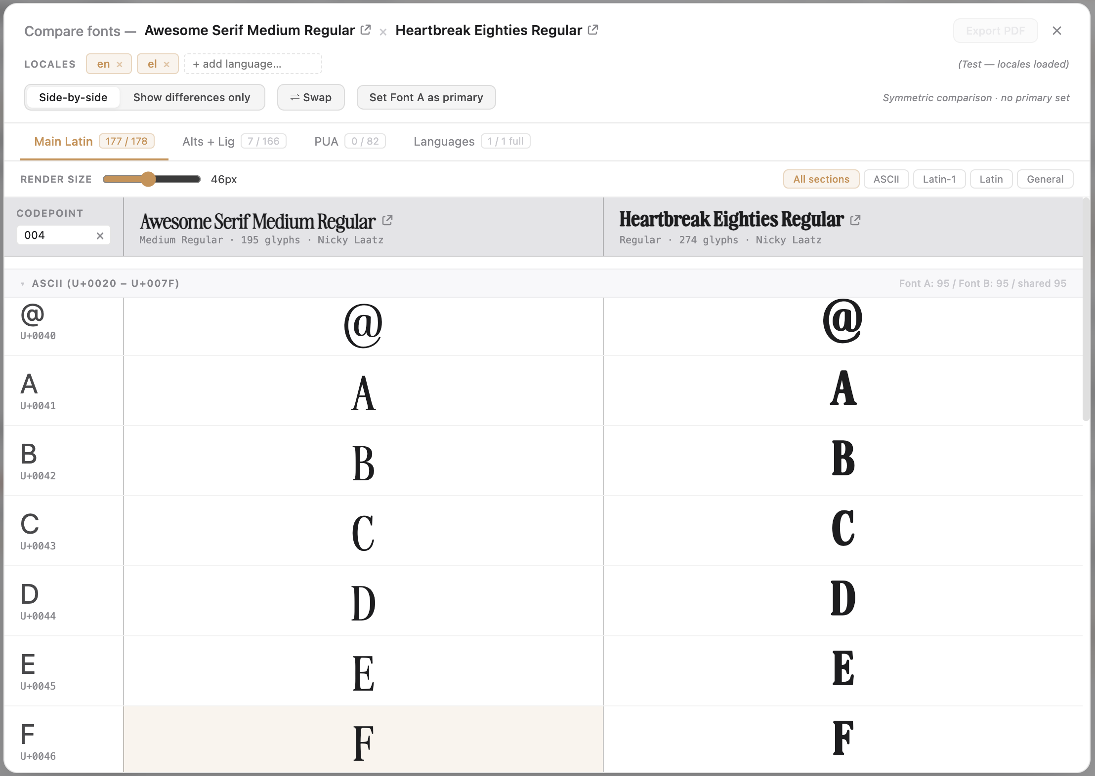
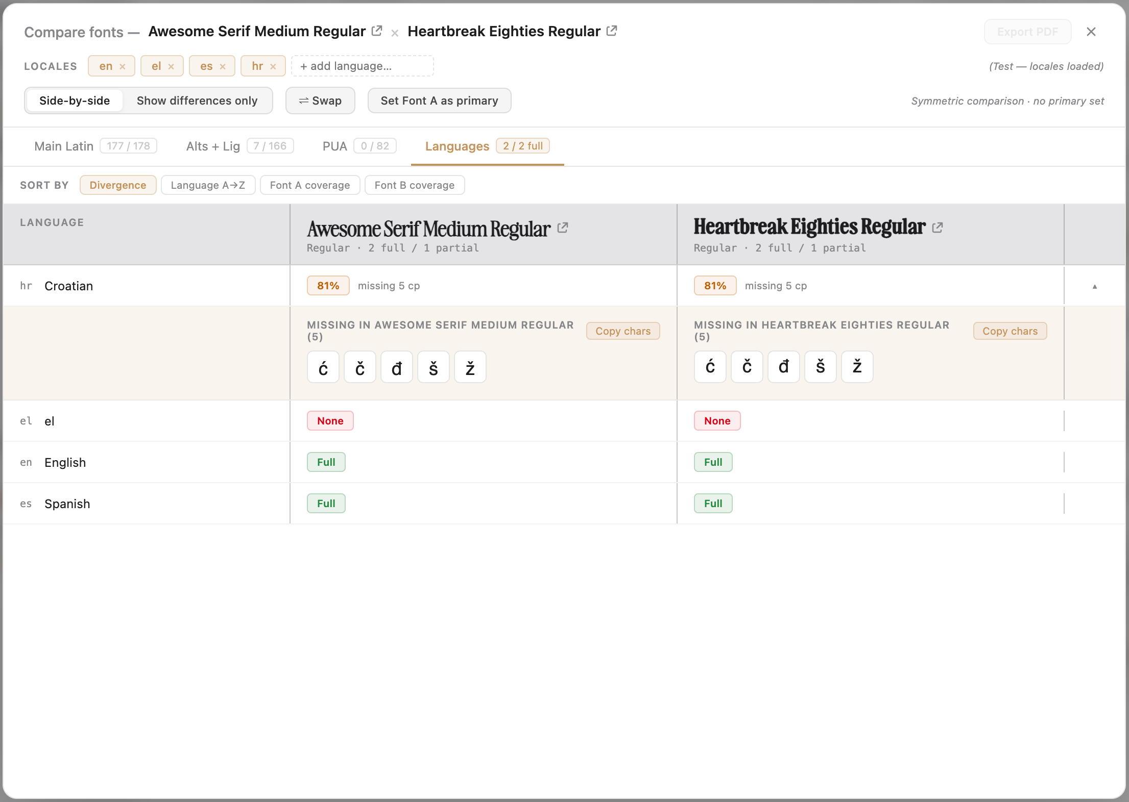
Select exactly two fonts in the library — hold to add the second — and the Compare button appears in the bulk-action toolbar, alongside Uninstall and Remove. Click it and the comparison window opens for those two fonts. Works from either the font or the project context, wherever you’re looking at a font list.

Non-destructive by design.

Compare is pure analysis. Opening it installs nothing, uninstalls nothing, modifies nothing — it just reads the two fonts and lays them out. Close any time with the × in the top-right or Esc. As with everything in FontCurator, the fonts stay where macOS keeps them and the analysis stays on your Mac.

Ready when you are

Stop guessing which font wins.
See them both, side by side.